Nterprisers Platform
Project Type: Interface Design & Development
During 2025, I was hired by Nterprisers as their sole UI Engineer & Designer. My role within the organization involved introducing design practices to my collegues and improve the front-end infrastructure and visual design of the Nterprisers Platform. The platform aims to improve how small business communicate with each other and advertise themselves across the decentralized manufacturing spaces. Nterprisers would first create simple profiles of small manufacturers based on available public records and submitting information request to state labor departments. Business owners could then claim their profile, or interested third-parties could use the platform's robust search to identify new partners and collaborators.
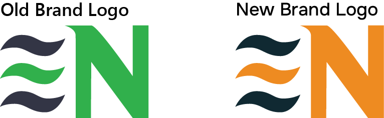
Originally, the organization had issues with their brand aesthetic. The colors and name often confused users and investors with the Enterprise rent-a-car brand. User research also informed the team that most owners of small manufacturing businesses were 55 years or older, so the interface needed to be easy to understand and the density of information had to be simplified.
Working alongside the CEO and a contracted marketing agency, we decided on a new color palette for the organization, and I conducted a short typographic research and chose Onest as the primary typeface to use for the platform.
The platform had several primary pages that had to be created:
- Dashboard
- Search
- Company Profile
- Registration
- Community Directory
- Messaging
Each aspect of the platform provided a useful set of features for different types of users and opportunities for Nterprisers to monetize the platform as the user base grew. Ultimately, I had to work amongst design and time constraints throughout the duration of work. Some pages had to be created quickly with fewer iterations and I knew there would be little opportunity to go back and make major changes again.
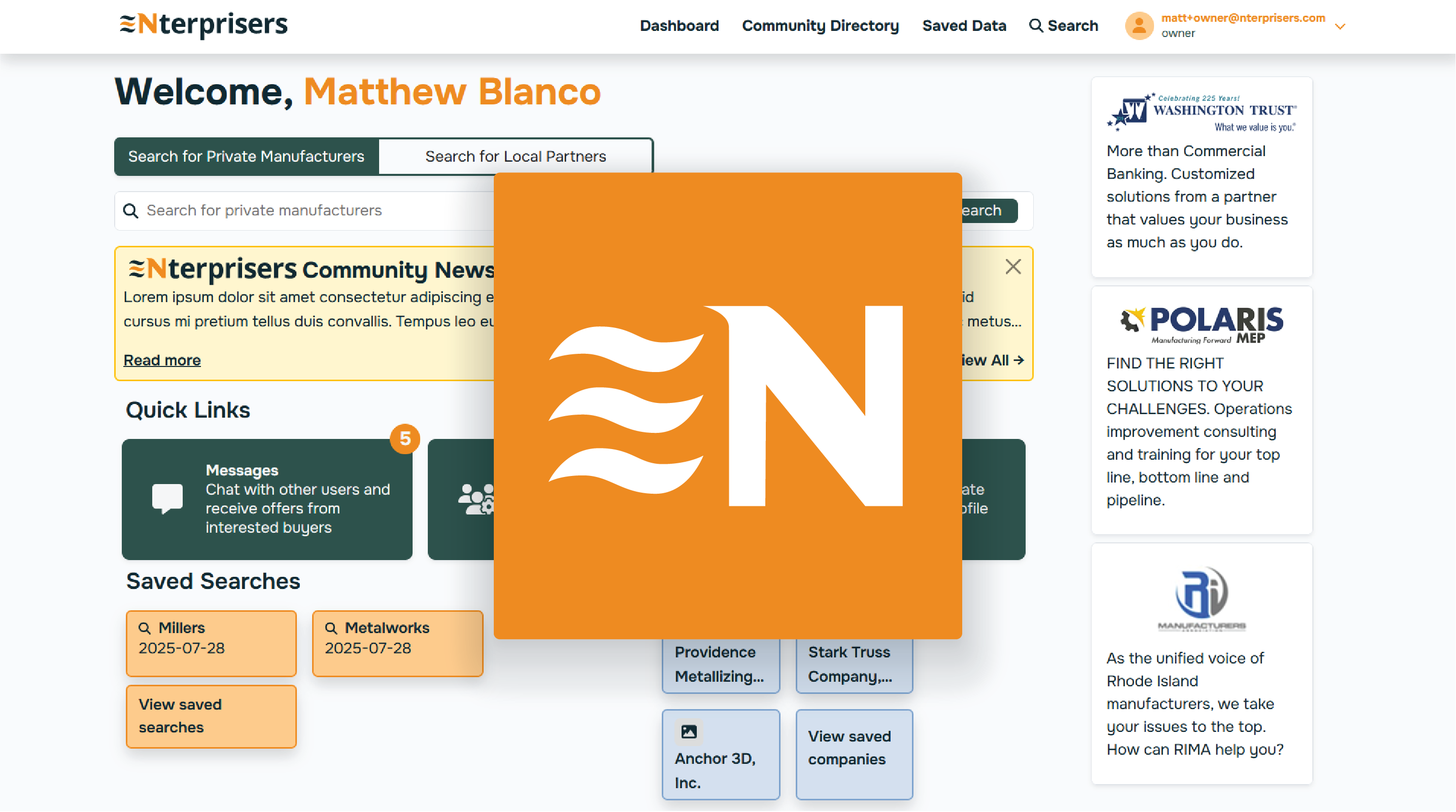
The interface was intended to be modular. Depending on the type of user logged in and subscription level, different amounts of information would be visible, so the interface had to have a consistent structure and feel. The orange and slate green aesthetic attributed the platform to manufacturing and industrial work while the typeface and rounded edges helped make the interface feel approachable and modern.
The interface took on a modular card-style aesthetic. Different features would exist within a card that had the same style across the platform to visually group related information together. Each card would sit above a slight grey backgroun with a drop-shadow to add depth to the interface.
Each page and feature followed a similar process throughout its development:
- Sketch and wireframe layouts
- Present page prototypes to stakeholders
- Iterate on feedback until final approval
- Implement features and pages into the front-end
- Coordinate with the development team to implement back-end functionality
- Test and fix issues
- Announce and release update
Over the course of six months, every corner of the platform had been re-designed and re-developed with a consistent visual style and software architecture. New team members could more easily onboard themselves with the code and design system.
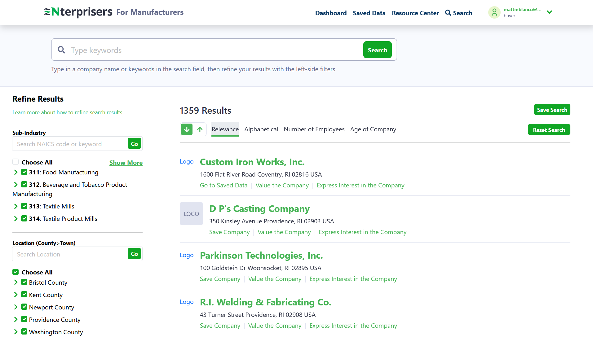 Original manufacturer search
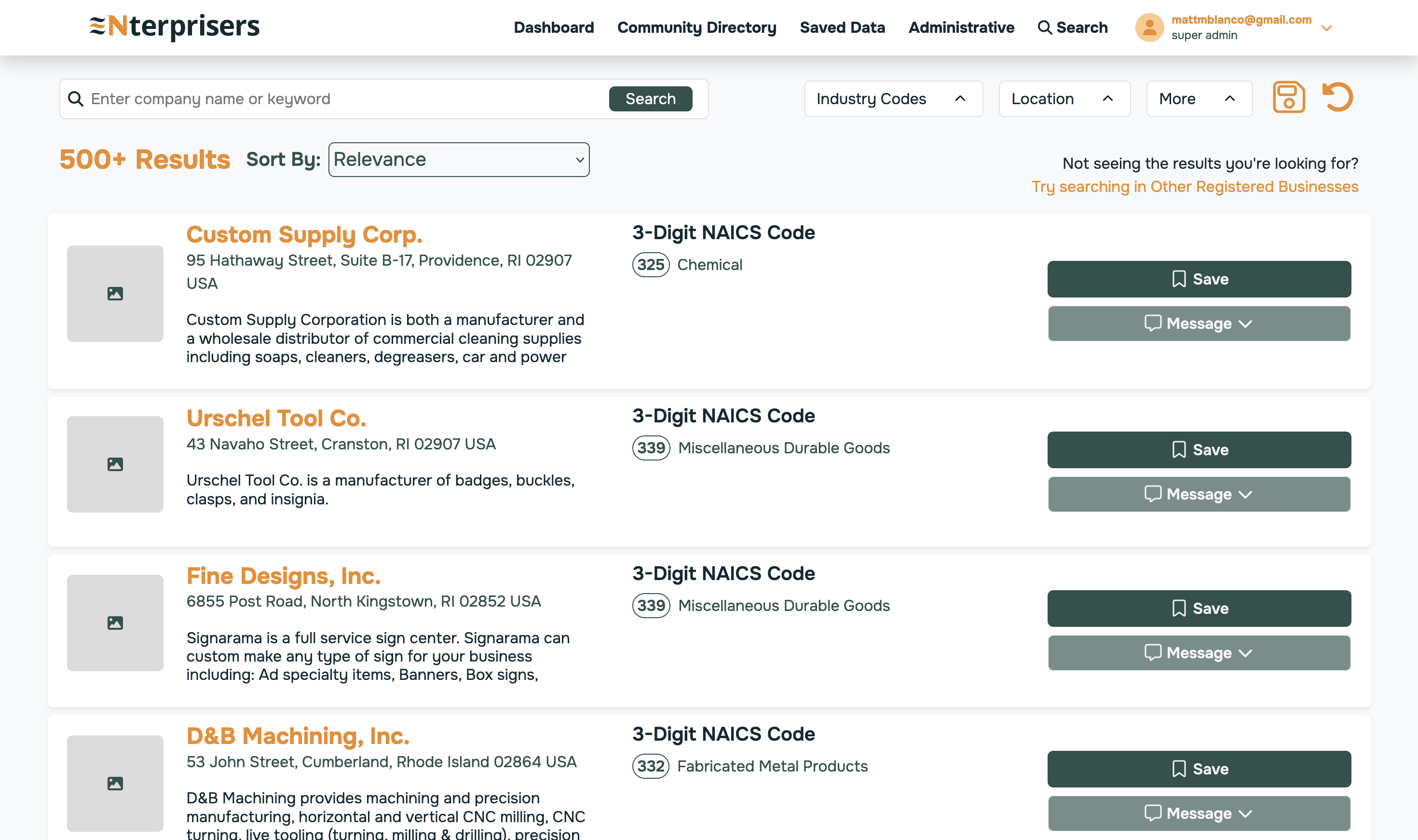 Redesigned advanced manufacturer search
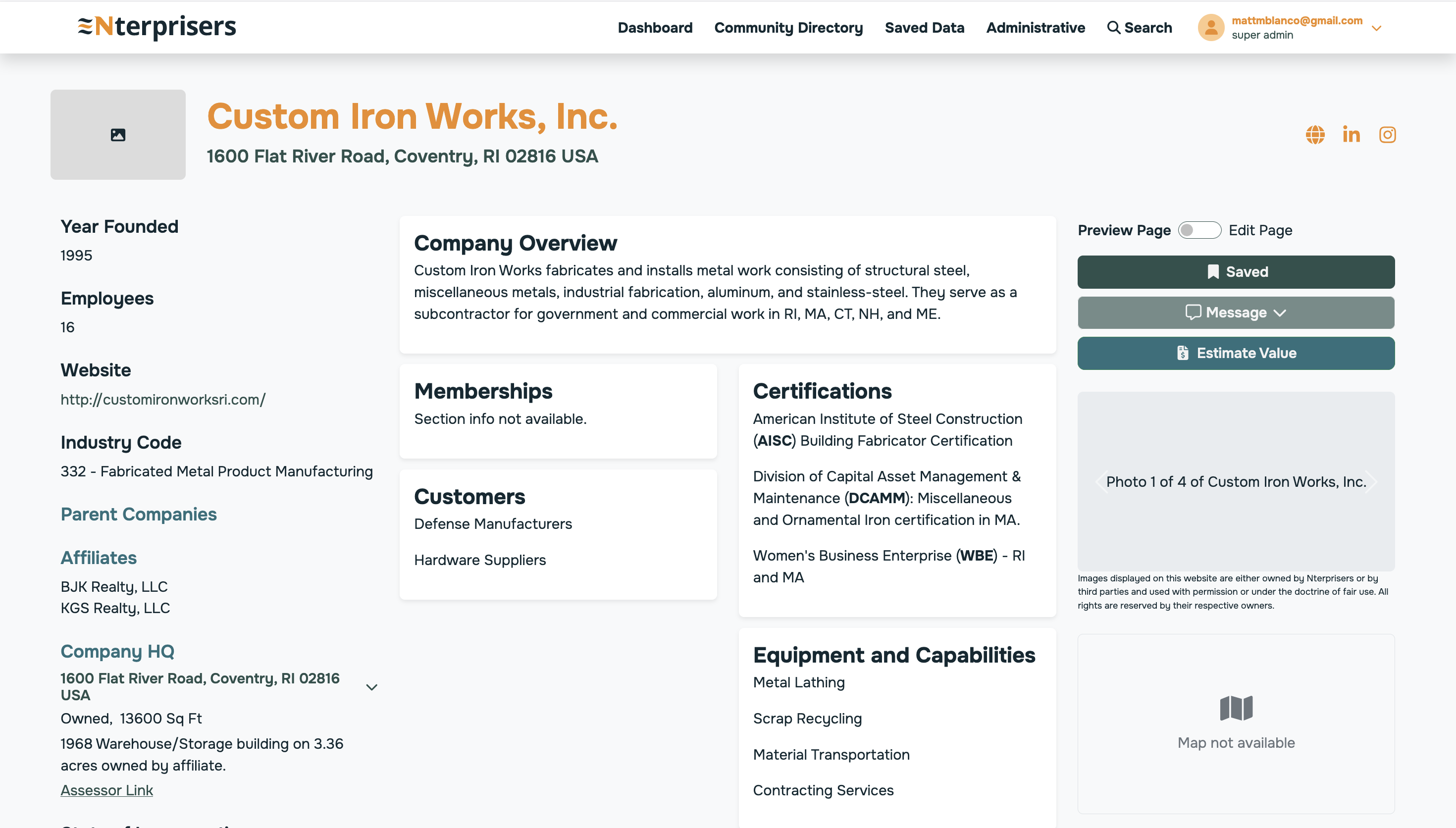 Example of a manufacturer's profile page
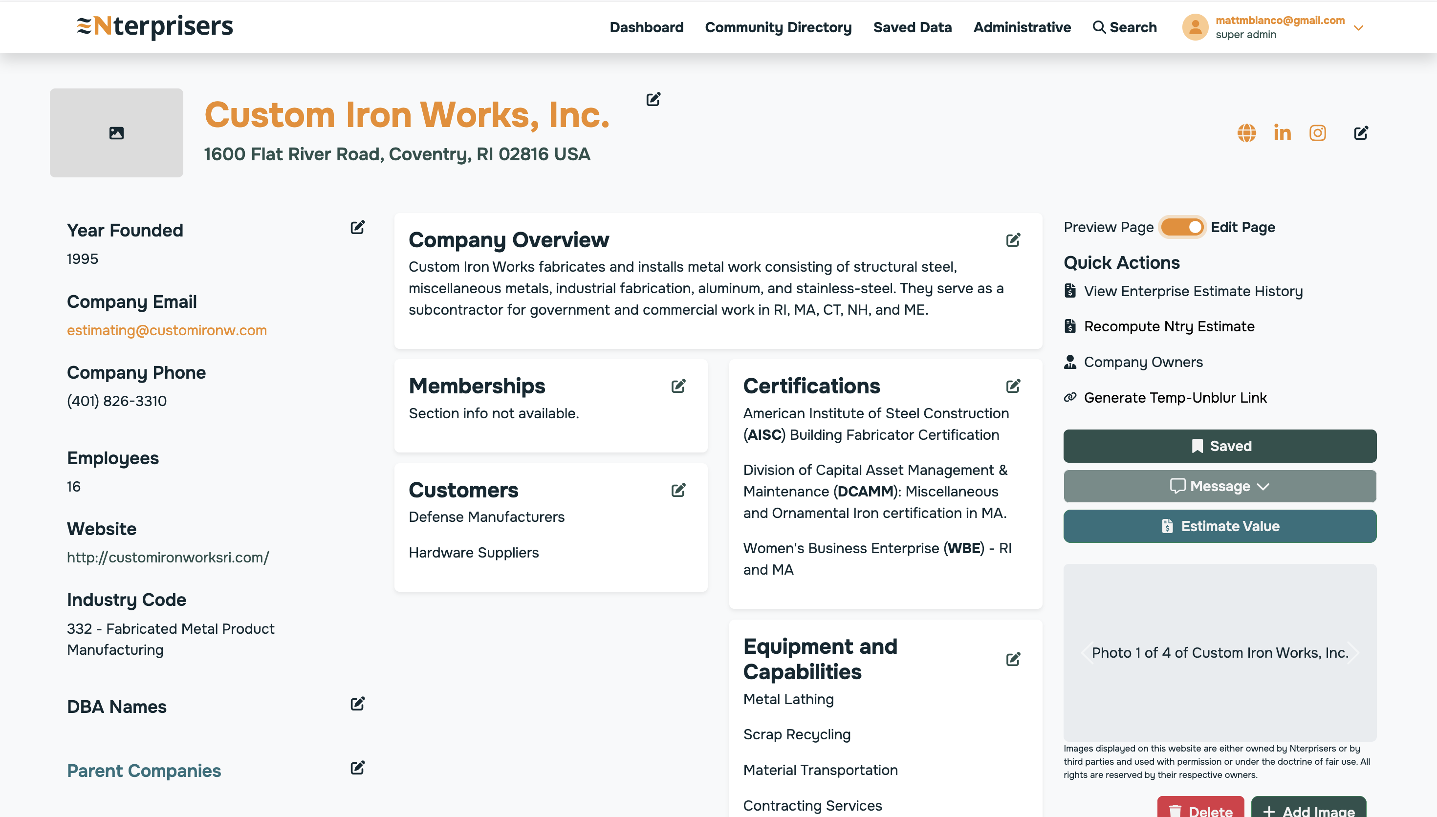 Example how the profile page changes based on user type
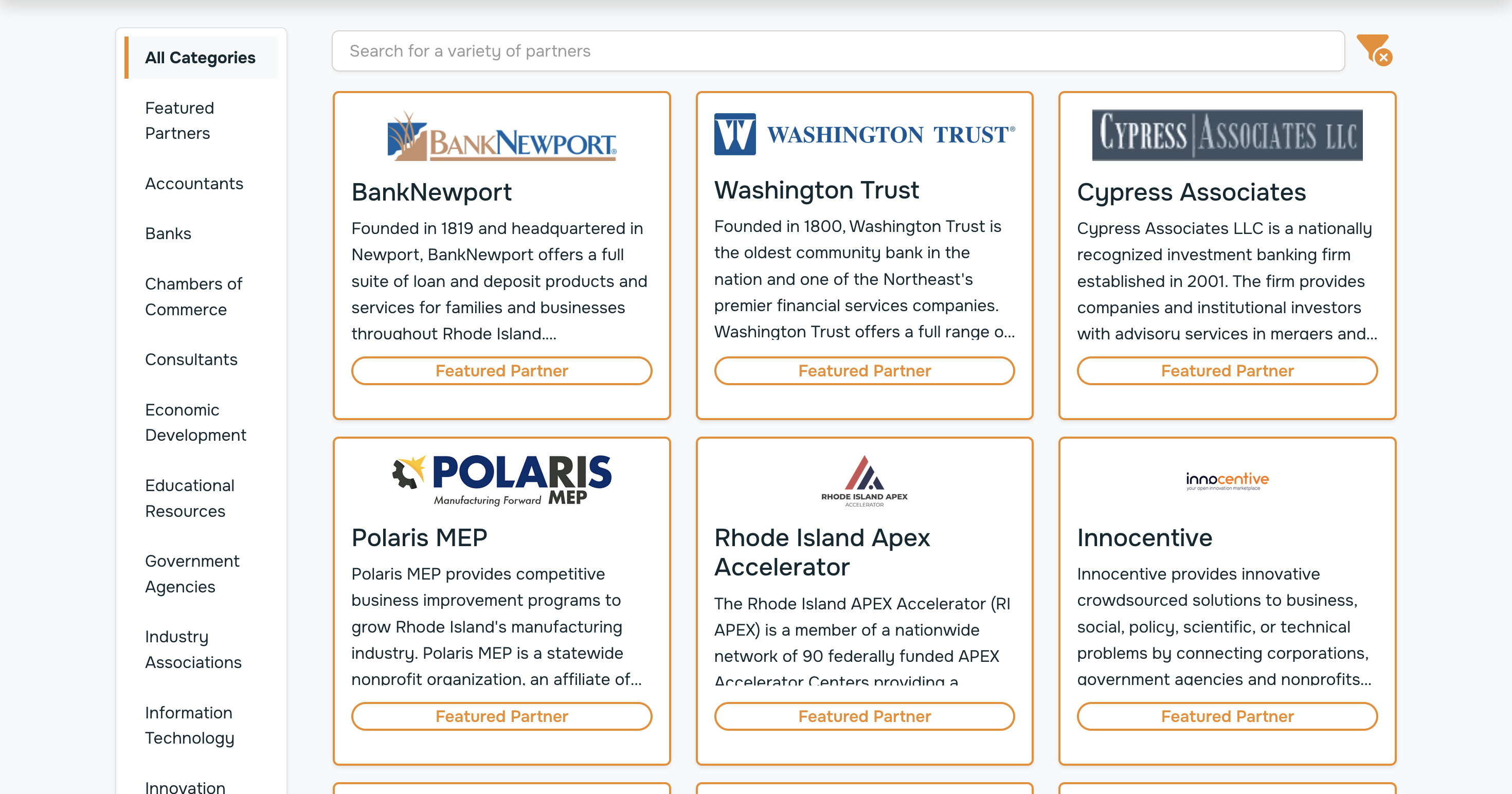 Directory of services to assist any manufacturering business