In 26 Slides
Project Type: Data Physicalization
Team
- Matthew Blanco
- Ryan Webber
- Christina TRan
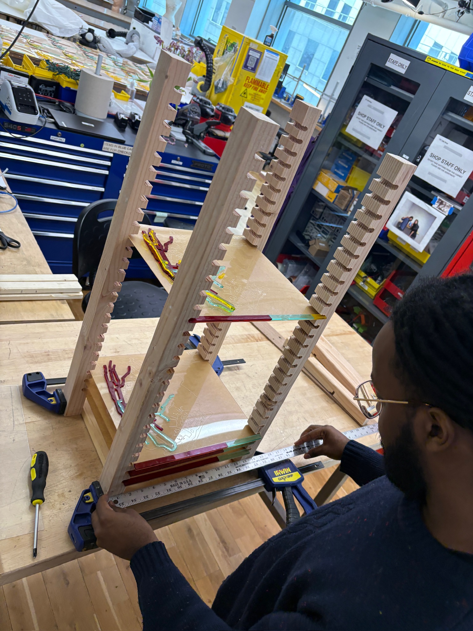
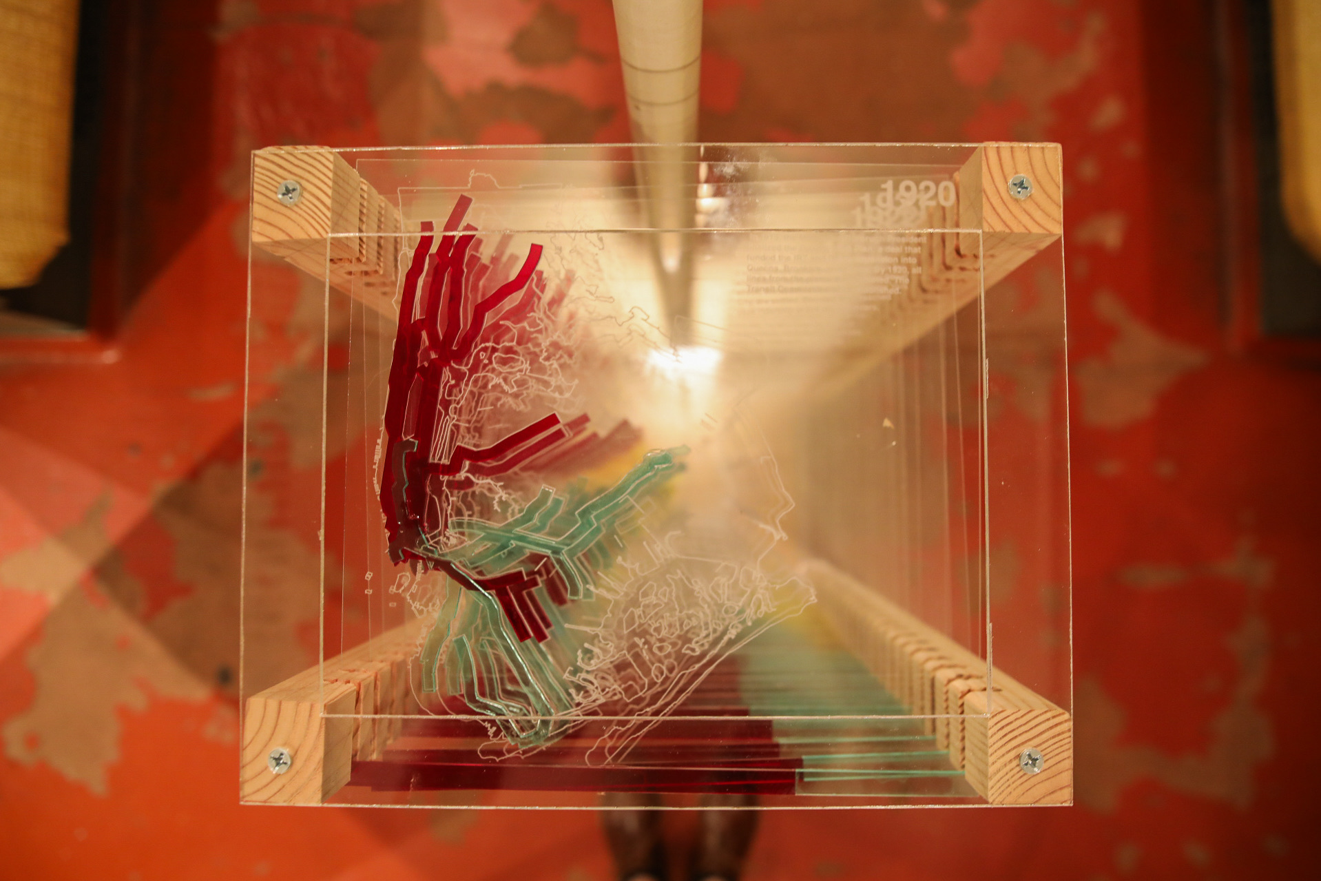
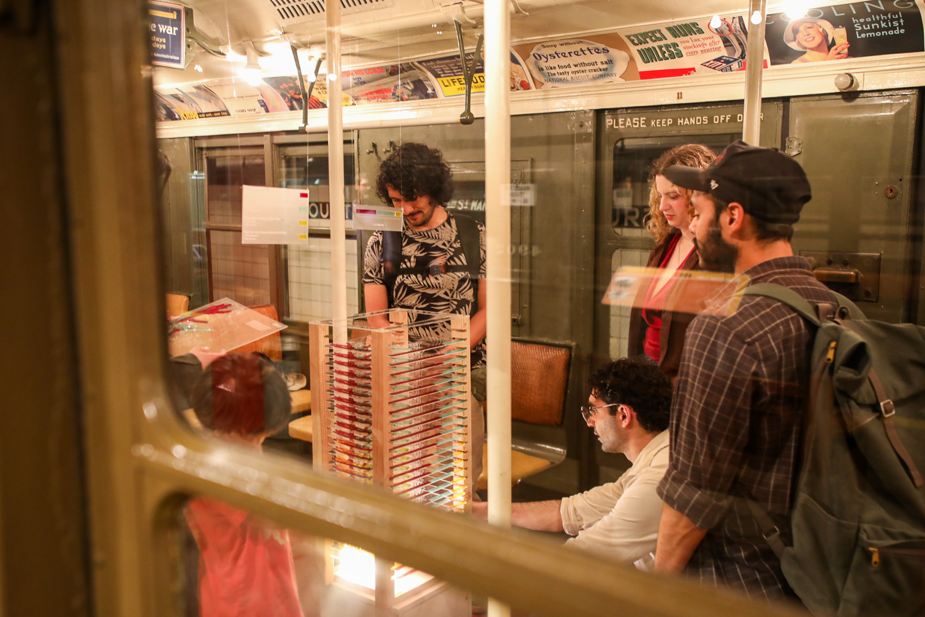
13in x 13in x 30in
Acrylic and Wood data sculpture
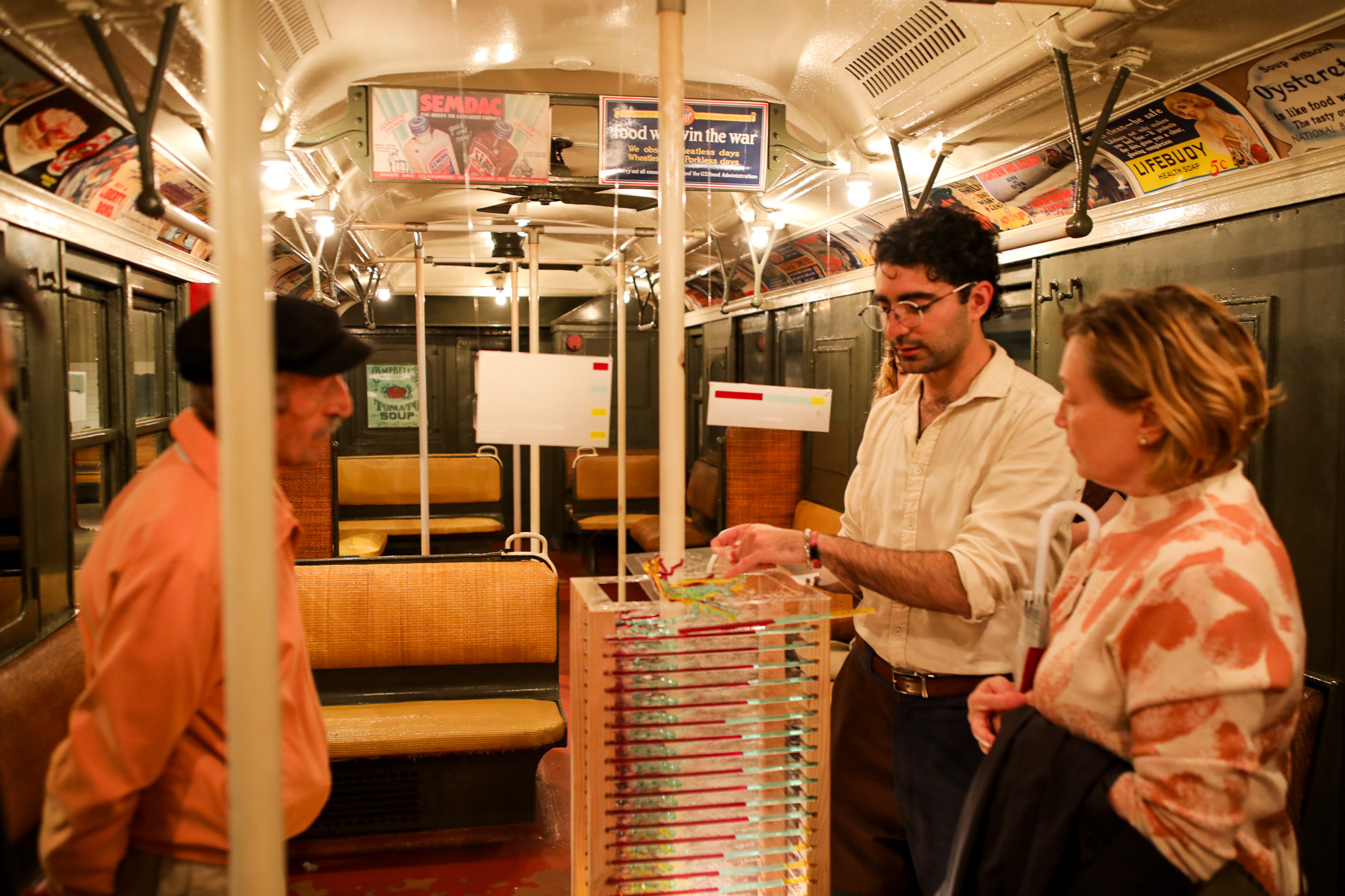
Using archival subway ridership data from 1920-1945, In 26 Slides tells the story of how the MTA became as we know it today. The work was showcased at the New York Transit Museum during The Transit Operas show. Material for the piece was provided by the Interactive Telecommunications Program at NYU.
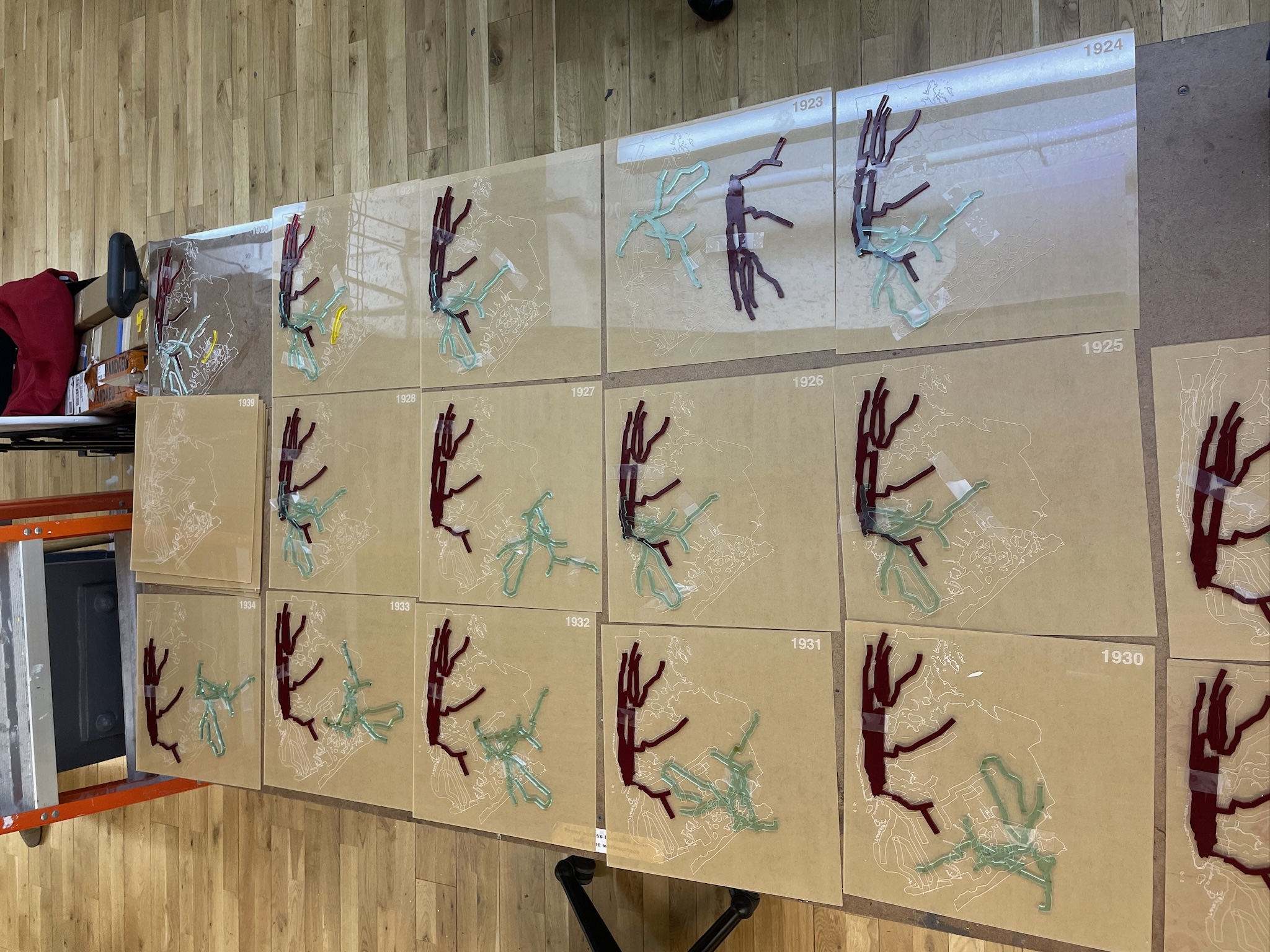
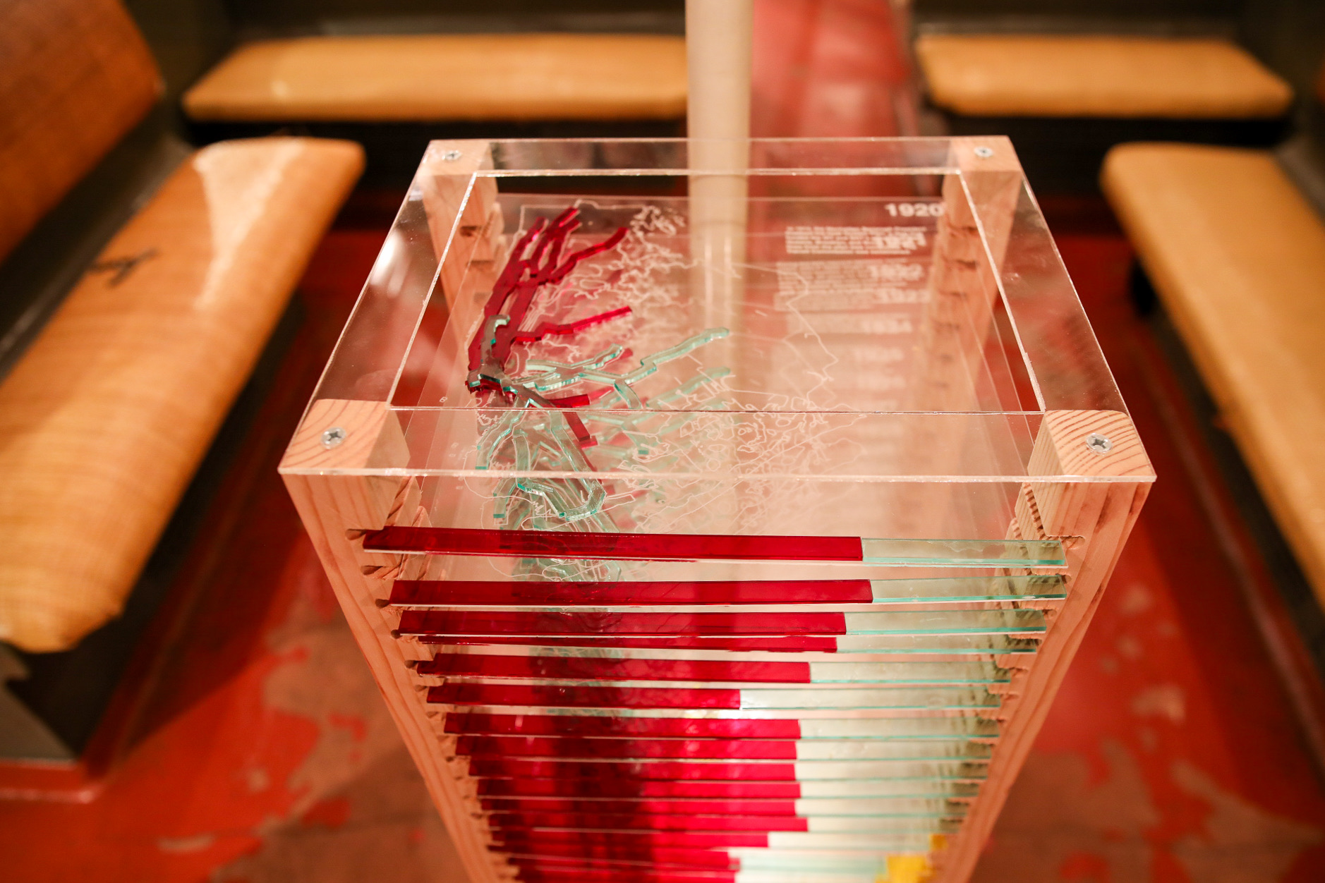
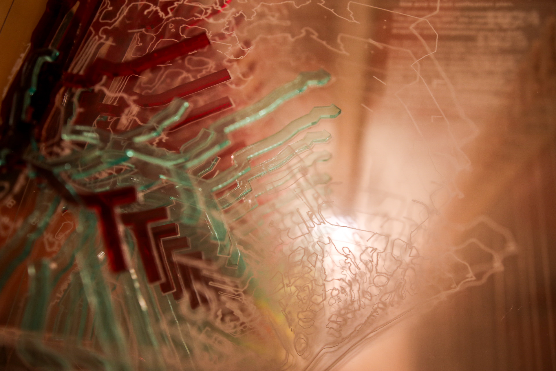
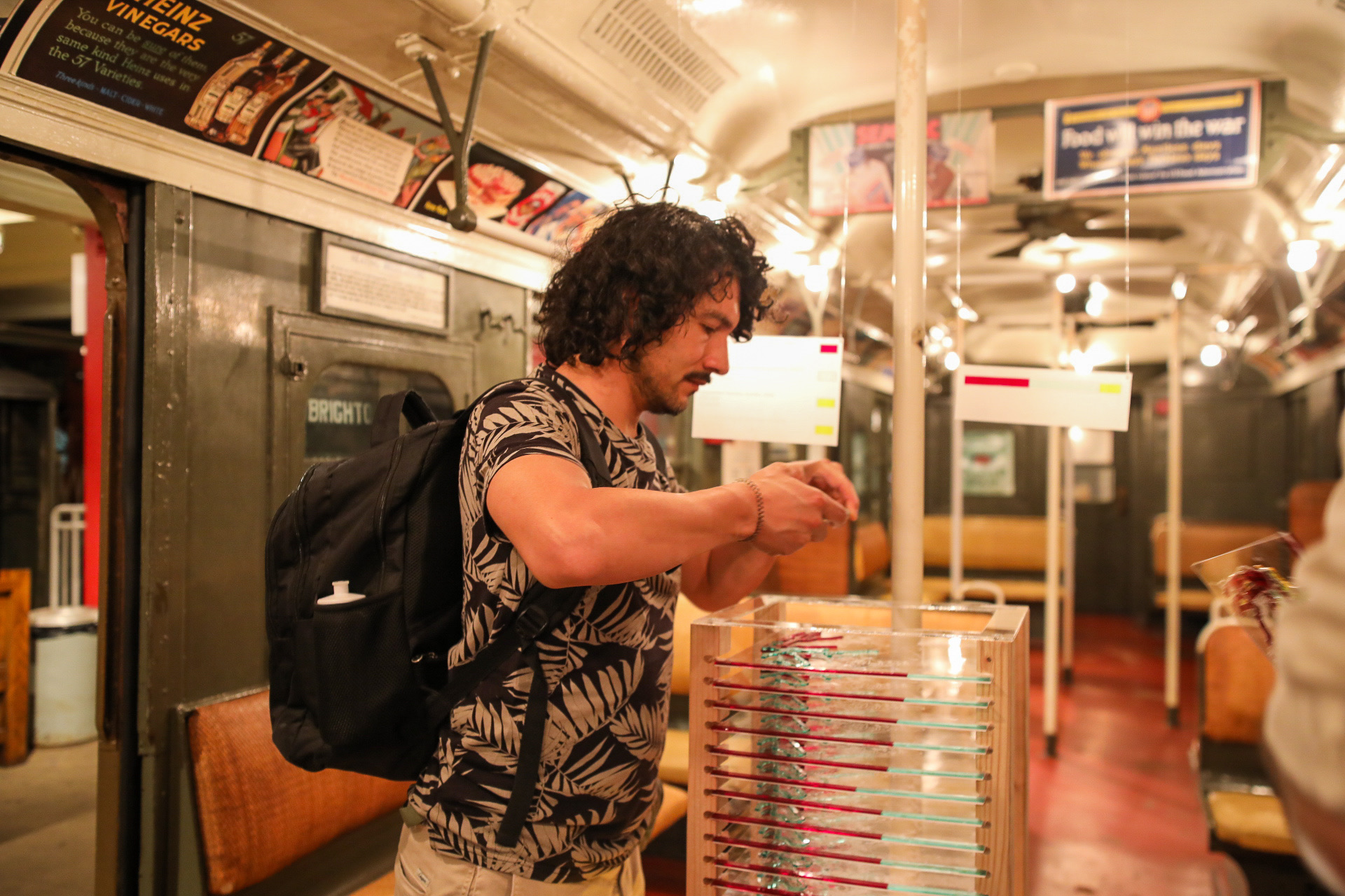
The goal of the project was to demonstrate how the ways people moved throughout the city changed over the decades. Through our research we learned about the rich history of the MTA, and that many of the modern quirks of the system were intentional design decisions when the subway was operated by three different companies. The piece consisted of 26 individual slides that could be pulled from its stand and read read on its own. The stacked view turned the visualized data into an abstract form where each side of the sculpture had it's own composition. Each slide contained a map of the transit system from that year, a short summary of historical context than may have effected ridership, and a bar graph comparing ridership from each transit company.
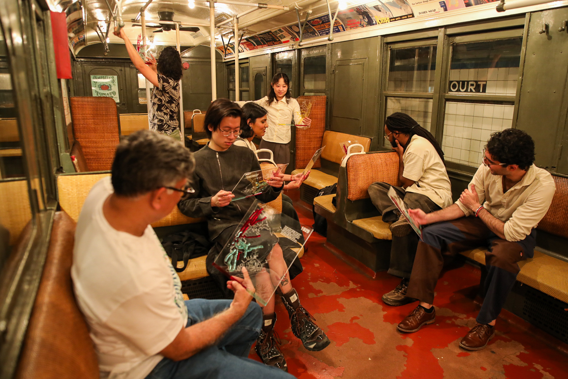
Throughout the exhibition, viewers would talk to us about their own experiences on the subway and try to find the lines and stops they visited most. The conversations demonstrated that the city, and the ways we move through it, is a living system. Over the course of the MTA's over hundred year history few subway stops have been decommisioned. For the most part new stops have been added and routes have changed names and ownership. New York has changed a lot since the first subway opened in 1907, but it continues to be the primary way people move.

Process
First the New York Transit Museum provided us with decades archival ridership data in the form of PDF files. Each file contained records of a variety of subway stops from different transit companies. Using OCR, the data was converted into spreadsheets to work with them more easily.
Originally we wanted to analyze the ridership of individual stops across historical subway lines, but the archival ridership data also provided incomplete subway routes. We researched old subway routes were to fill out and unavailable data. Using historical websites, all of the old routes paths were reconstructed, and luckily few stops were removed. Manhattan's above ground subway lines were decommisioned in 1938, but otherwise only new stops were added between 1920-1945.
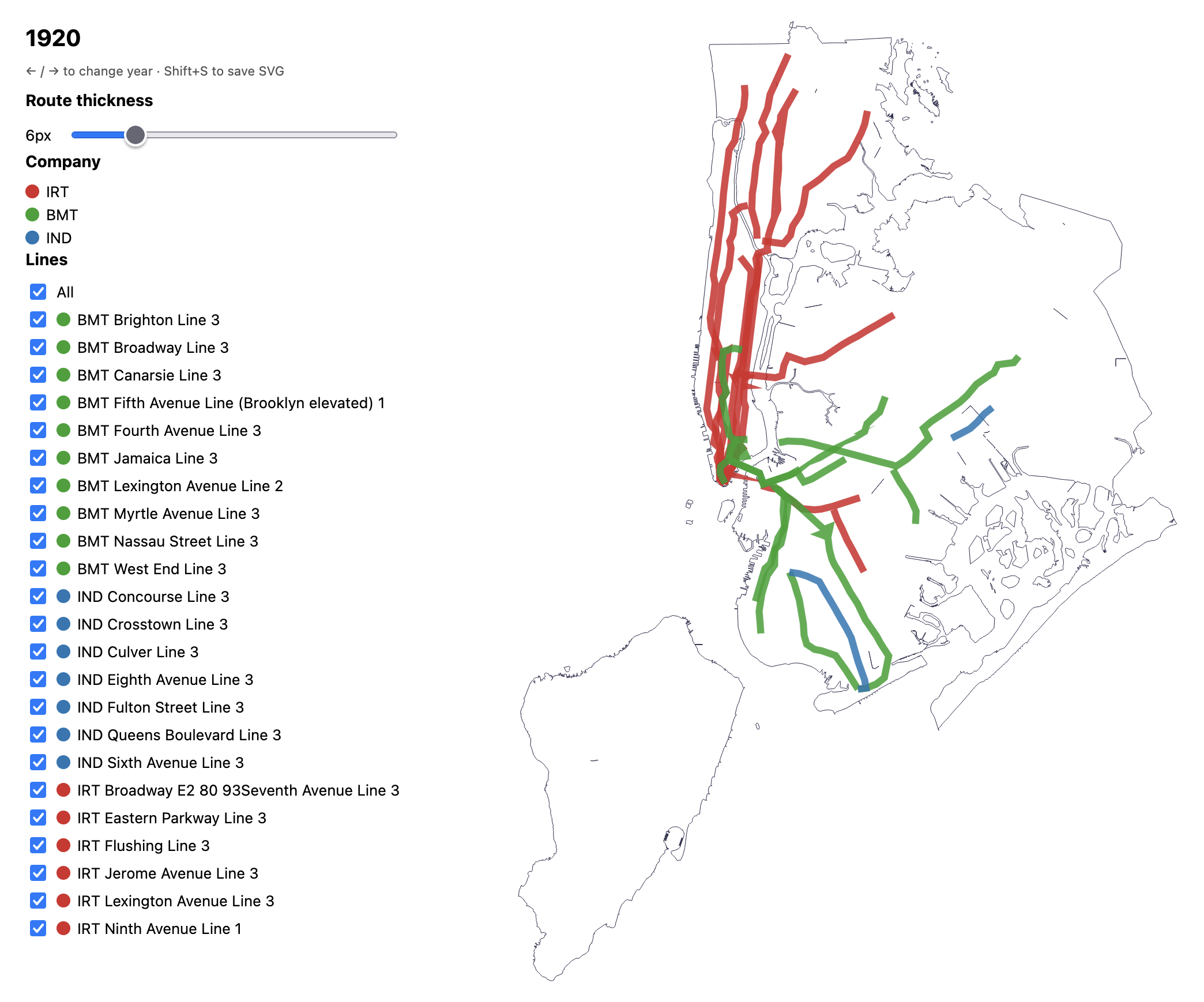
Using D3, a JavaScript data visualization library, exploratory digital versions of the subway maps were created. The digital visualizations were refined to be easily explorted into a handful of SVG layers that could be brought into Adobe Illustrator to prepare for laser cutting. 12x12 panels of clear acrylic were engraved with a map of New York City before cutting the routes for each individual subway company. Overlapping subway routes were stacked on one another providing a small amount of depth to each slide.